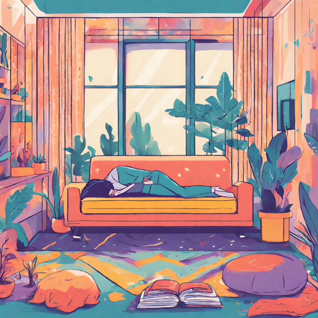
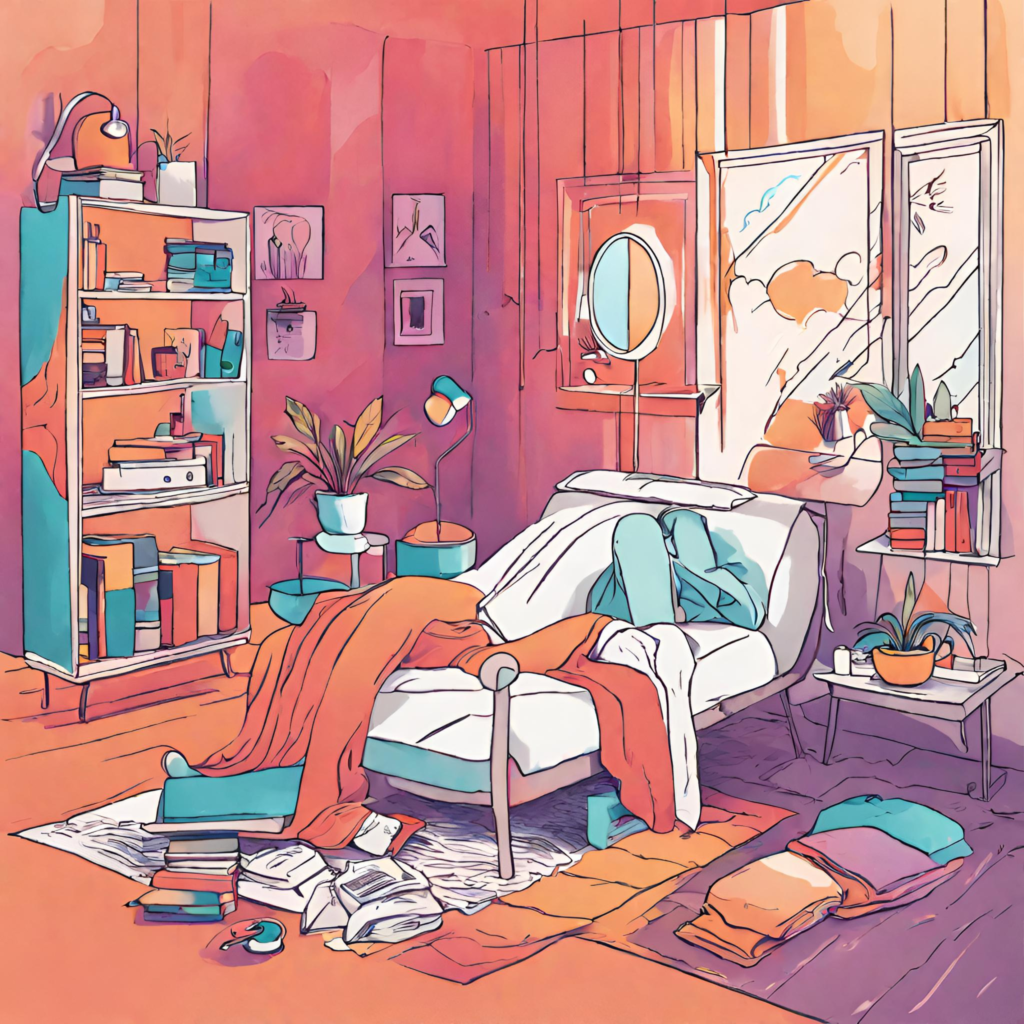
The profound impact of color on our daily lives extends well beyond aesthetic appeal. In the context of relaxation and sleep, the concept of color therapy for sleep environments has gained significant recognition. This article delves into how different hues influence the creation of ideal napping spaces, exploring the intriguing interplay between colors and their effects on sleep quality and relaxation.
Understanding the Essentials of Chromotherapy for Better Sleep
Color therapy, also known as chromotherapy, is an ancient practice now embraced in modern therapeutic settings. It’s based on the idea that colors can evoke specific psychological responses and influence our emotional states. In the realm of enhancing naps with color therapy, this principle is particularly relevant. Some colors stimulate the mind and energize the body, while others have a calming effect, essential for inducing a state of relaxation conducive to restful sleep.
The Role of Colors in Creating Calm Sleep Spaces
Crafting a napping environment that promotes effective rest involves more than dimming lights and ensuring silence. The color palette of your napping space plays a critical role. It’s not only about personal taste; certain colors can significantly improve sleep quality, aiding individuals to unwind and detach from daily stresses. The impact of colors on sleep quality is such that a well-chosen color scheme can transform any room into a sanctuary of peace and serenity.
Colors and Their Influence on Sleep Quality
Each color possesses unique properties that affect our relaxation and sleep:
- Blue: Often considered the most conducive color for sleep, blue emanates calmness and serenity. Its ability to lower blood pressure and heart rate makes it an ideal choice for napping environments. The tranquility evoked by shades of blue is akin to gazing at a peaceful sky or a calm sea.
- Green: Echoing the tranquility of nature, green is synonymous with rejuvenation and serenity. It’s believed to have a soothing effect on the mind and body, fostering a restful atmosphere conducive to relaxation and rest.
- Violet: Known for its meditative qualities, particularly in softer shades like lavender, violet can foster a sense of calm, aiding in the transition from day-to-day alertness to restfulness.
While these colors are traditionally linked with relaxation, personal preferences are also crucial. What is calming for one person may not be the same for another, highlighting the importance of creating calm sleep spaces with colors that resonate on a personal level.

Integrating Color Therapy into Napping Spaces
Employing color therapy in napping environments goes beyond painting walls. It encompasses everything from the color of the bedding to the choice of accessories:
- Walls: Opting for wall colors that promote relaxation is essential. Soft, muted tones generally create a more conducive atmosphere for sleep than bright, bold hues.
- Bedding: Selecting bedding colors that harmonize with the walls can enhance the room’s overall calming effect.
- Accessories: Accessories like curtains, rugs, and artwork in line with your chosen color theme can subtly reinforce the tranquil ambiance of the room.
- Lighting: The way lighting interacts with room colors is also crucial. Soft, warm lighting can amplify the soothing effect of your chosen palette, enhancing the overall experience of colorful napping spaces for relaxation.
Balancing Color Schemes for Optimal Nap Environments
Achieving a balanced color scheme is vital for creating an environment conducive to rest. Vibrant colors might be stimulating and disruptive to sleep, whereas too muted a palette could render the space uninspiring. The key is finding a middle ground with colors that are soothing yet possess enough warmth to create a cozy atmosphere. For instance, pairing soft blue with creamy neutrals can provide a peaceful yet inviting environment, perfectly aligning with the principles of chromotherapy for better sleep.
Personalizing Your Nap Space with Color Therapy
Personal preference plays a critical role in designing your napping area. While certain colors are widely recognized for their calming effects, the final choice should align with your personal comfort and aesthetic preferences. If you’re someone who indulges in power naps, you might prefer brighter, more energizing colors that help you wake up refreshed. On the other hand, for longer naps, softer, more subdued tones could be ideal. Experiment with different hues to discover what uniquely works for you, effectively utilizing color therapy for sleep environments.
The Synergy of Light and Color in Napping Spaces
The interplay between light and color is crucial in establishing the right atmosphere for your napping space. Natural light can enhance the true beauty of colors, but in its absence, appropriate artificial lighting can create a similar ambiance. The warmth or coolness of the light significantly impacts how colors are perceived and experienced in the room. Soft, warm lighting can make colors feel more inviting, while cooler light might bring out the vibrancy in certain hues, aligning with the concept of enhancing naps with color therapy.

Expanding Color Therapy Beyond Visual Elements
Color therapy in napping environments isn’t limited to tangible elements like walls and decor. Introducing colored light sources, such as lamps with colored bulbs, can add an additional layer to your therapeutic napping environment. Furthermore, visualization techniques involving colors can also be effective. Imagine being surrounded by a calming color as you drift into a nap, embracing the idea of creating calm sleep spaces with colors, even in the absence of physical color elements.
Embracing Technology in Color Therapy
With advancements in technology, integrating color therapy into your napping routine has become more accessible. Applications that simulate calming colors or smart lighting systems enabling color changes at the touch of a button are excellent modern tools. These technologies are especially useful for individuals wishing to experiment with different colors to find the most relaxing combination for their napping needs.
Conclusion: The Transformative Power of Colors in Sleep Environments
The influence of color on mood and sleep quality cannot be overstated. Thoughtfully incorporating color therapy into your napping environment can transform a simple space into one that not only appeals to your senses but also promotes restful, rejuvenating sleep. Remember, the most effective color for your nap space is the one that resonates with your personal preferences and aids in achieving the relaxation and restfulness you seek.
FAQs: Enhancing Your Napping Experience with Color Therapy
Here are answers to some frequently asked questions about color therapy in napping environments:
While blues, greens, and violets are generally recommended for their calming effects, the most relaxing color can vary based on personal preference.
While typically more stimulating, vibrant colors can be used effectively as accent elements or in environments suited for power naps.
The type of lighting can alter how colors appear and feel, with warm light enhancing coziness and cool light emphasizing crispness.
Absolutely. Incorporating color therapy can be as simple as using colored bedding, accessories, or even colored lighting to influence the room’s mood.


